Design Token Expertise
With deep expertise in design tokens and systematic design infrastructure, I've helped enterprise teams build scalable, maintainable design systems that bridge the gap between design and development.
 Dentsu
 Merkle
 PenCS
PenCS
All these efforts now get generated by just me and AI. I attended the Into Design Systems AI Conference 2026 and I'm now applying what I learned:
AI Design Systems
conference and community · March 19–20, 2026
Technical Capabilities
 Token Studio
 StyleDictionary
 Chakra UI
 Plasmic
- Token Studio for Figma - Creating and managing design tokens directly within Figma for seamless designer-developer handoff
- StyleDictionary pipelines - Transforming design tokens into platform-specific outputs (CSS, iOS, Android, JSON)
- Chakra UI token theming - Implementing semantic token layers and component-level theming with Chakra's design system
- Plasmic token registration - Configuring design tokens for low-code/no-code visual builders and content editors
Colors
Primary Palette
Neon Palette (Hero/Dark Sections)
Color Symbolism: Discovery & Delivery
Colors in this design system carry intentional meaning, representing the dual nature of innovation work.
Blue: Discovery
- Creativity - Exploration of new ideas and possibilities
- Divergence - Expanding options, brainstorming, ideation
- Innovation - Pushing boundaries, experimentation
- Openness - Receptive to change and new perspectives
Used for: Primary branding, CTAs in discovery contexts, ideation phases
Pink/Magenta: Delivery
- Execution - Turning ideas into tangible outcomes
- Convergence - Narrowing focus, making decisions
- Implementation - Building, shipping, completing
- Results - Measurable impact and delivery
Used for: Delivery milestones, completion states, execution phases
The Innovation Shift
This color duality represents the fundamental shift in how we innovate. The balance between blue (discovery) and pink (delivery) visualizes the complete innovation cycle - from creative exploration to successful execution.
Vortex & Torus Imagery
The visual language incorporates dynamic, flowing forms that reinforce the concept of continuous innovation and transformation.
Vortex/Swirl Motif
The hero background features a deep blue vortex swirl representing the gravitational pull of innovation - ideas spiraling inward toward focus and execution.
- Movement: Clockwise spiral suggesting forward momentum
- Depth: Dark center with luminous edges creates dimensional depth
- Color gradient: Deep navy to electric blue, maintaining brand palette
- Symbolism: Ideas converging from chaos into clarity
Torus Energy Flow
The torus (donut-shaped) energy pattern represents the cyclical nature of innovation - continuous flow between discovery and delivery.
- Circulation: Energy flows in through one pole, out through the other
- Balance: Represents equilibrium between creative input and productive output
- Sustainability: Self-renewing cycle of ideation and execution
- Application: Subtle background elements, section transitions, loading states
Design principle: These flowing, organic forms contrast with the angular, structured elements of UI components - creating visual tension between creative expression and systematic execution.
Text Colors
Background Colors
Typography
Font Families
-apple-system, BlinkMacSystemFont, 'Segoe UI', 'Roboto', 'Oxygen', 'Ubuntu', 'Cantarell', sans-serif
'SF Mono', 'Monaco', 'Inconsolata', 'Fira Code', 'Consolas', monospace
Type Scale
Hero Headline
Section Title
H2 Heading
H3 Heading
Subheading / Large Text
Lead paragraph or emphasized text
Slightly larger body text for introductions
Standard body text used throughout the site for regular content.
Small text for labels, captions, and secondary information
Extra small text for tags, metadata, and fine print
Font Weights
Spacing
Spacing Scale
0.25rem
0.5rem
0.75rem
1rem
1.25rem
1.5rem
2rem
2.5rem
3rem
4rem
5rem
6rem
Components
Buttons
.btn { padding: 1rem 2rem; font-weight: 600; border-radius: 0.5rem; }
.btn-primary { background: white; color: var(--color-primary); }
.btn-secondary { background: transparent; border: 2px solid; }
.btn-cta { background: linear-gradient(135deg, var(--color-primary), var(--color-secondary)); }
Shadows
Border Radius
0.25rem
0.375rem
0.5rem
0.75rem
1rem
9999px
Image Style Guide
AI-Generated Illustrations
AI-generated images should maintain brand consistency while showcasing creative possibilities.
- Style: Clean, modern illustration style with soft gradients
- Color palette: Use brand colors (blues, purples, cyans) or client brand colors
- Background: Simple, non-distracting backgrounds that complement the subject
- Subject matter: Technology, nature, abstract concepts - aligned with content theme
- Resolution: Generate at minimum 1024x1024 for web use
- Format: PNG for illustrations with transparency, WEBP for photos
Do
- Use consistent illustration styles
- Match brand color palette
- Iterate prompts for quality
- Optimize file sizes for web
- Use descriptive alt text
Don't
- Mix conflicting art styles
- Use low-resolution images
- Include text in AI images
- Ignore compression
- Use without review
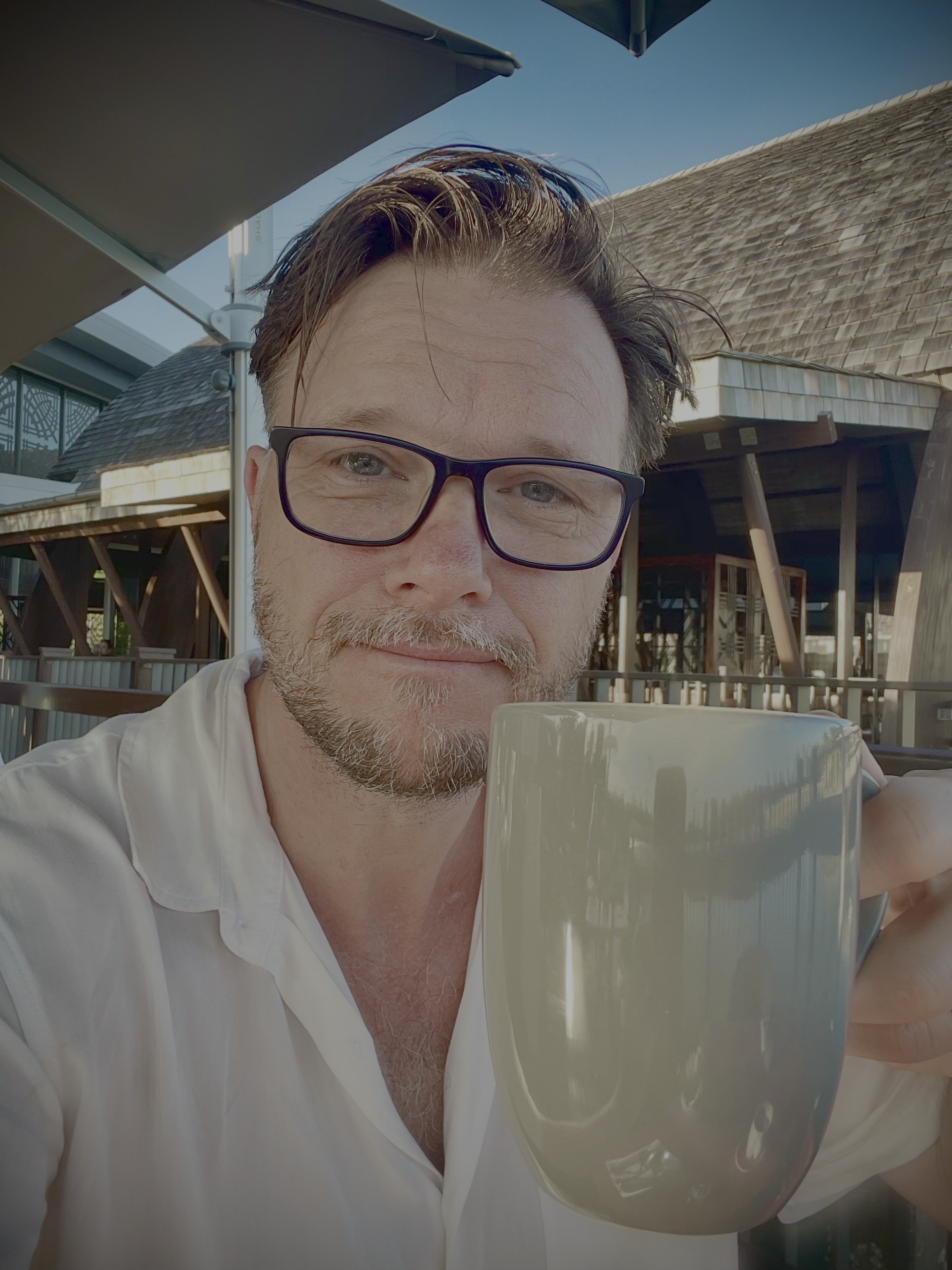
Profile & Headshot Photos
Professional photos that convey approachability and expertise.
- Shape: Circular crop with border (4px solid primary color)
- Size: Hero: 120x120px, Nav: 50x50px, About: 150x150px
- Effect: Box shadow for depth (8px blur, 30% opacity)
- Style: Professional but approachable, natural lighting
- Background: Neutral or complementary to brand colors
border-radius: 50%;
border: 4px solid var(--color-primary);
box-shadow: 0 8px 30px rgba(37, 99, 235, 0.4);
object-fit: cover;
}
Client & Project Logos
Logos should be displayed consistently while respecting original brand guidelines.
- Max dimensions: 200px wide, 60px tall (maintain aspect ratio)
- Format: SVG preferred, PNG with transparency as fallback
- Alignment: Left-aligned within project cards
- Hover effect: Subtle opacity transition (0.8 on hover)
- Container: Minimum height of 60px for consistent alignment
max-width: 200px;
max-height: 60px;
object-fit: contain;
}
Background Images & SVG Overlays
Layered backgrounds create depth while maintaining text legibility.
- Hero background: Dark, atmospheric imagery (swirl/vortex theme)
- Overlay SVGs: Robot/AI icons with neon glow effects
- Opacity: Background overlays at 0.4-0.6 for text contrast
- Neon colors: #FF00FF (magenta), #00FFFF (cyan) for glow effects
- Mobile: Reduce overlay opacity further (0.15-0.25) for readability
.hero { background: url('hero-swirl-bg.jpg') center/cover; }
.hero::before { background: url('ai-icons-bg.svg'); z-index: 1; }
.hero::after { background: radial-gradient(...); z-index: 2; }
.hero-content { z-index: 5; }
SVG Icons & Graphics
Scalable vector graphics for crisp display at any resolution.
- Stroke width: 1.5-2.5px for consistent visual weight
- Colors: Use currentColor for theme flexibility
- Glow effects: feGaussianBlur with stdDeviation 4-5
- Opacity: Decorative icons at 0.4-0.6, interactive at full opacity
- ViewBox: Always include for proper scaling
<filter id="glow">
<feGaussianBlur stdDeviation="5" result="coloredBlur"/>
<feMerge>
<feMergeNode in="coloredBlur"/>
<feMergeNode in="SourceGraphic"/>
</feMerge>
</filter>
Image Optimization
Performance best practices for fast-loading images.
- Format priority: SVG > WEBP > PNG > JPG
- Compression: Use 80-85% quality for JPG/WEBP
- Lazy loading: Add loading="lazy" for below-fold images
- Responsive: Provide multiple sizes via srcset when needed
- Alt text: Always include descriptive, meaningful alt attributes
- Max file size: Target under 100KB for decorative, 200KB for hero images
Image Asset Library
All images, logos, and visual assets used throughout this portfolio website.
Profile Photos


Logo Assets
Client & Company Logos
Design Token Tool Logos
Hero & Background Images
SVG Overlay Backgrounds
AI-Generated Illustrations
Diagrams & Graphics
Icons & Decorative Elements
A library of SVG icons and decorative elements used throughout the portfolio, featuring neon glow effects in magenta and cyan.
Robot Icon Library
Five distinct robot/AI icon styles representing different aspects of AI-powered development.
UI & Functional Icons
Feather-style stroke icons used for navigation, actions, and interactive elements throughout the site.
Icon Guidelines
- Style: Feather Icons style (stroke-based, rounded caps)
- Stroke width: 2px standard, 1.5px for smaller sizes
- Size: 24px standard, 32px for stat cards, 16px inline
- Color: Use currentColor for theme flexibility
- Exceptions: LinkedIn uses fill instead of stroke (brand requirement)
<svg viewBox="0 0 24 24" fill="none"
stroke="currentColor" stroke-width="2"
stroke-linecap="round" stroke-linejoin="round">
Code Text Elements
Monospace code snippets that appear as decorative floating elements.
Floating Particles & Stars
Small glowing dots that add depth and ambient movement to dark sections.
- Size: 2-5px radius circles
- Colors: #FF00FF and #00FFFF
- Glow: feGaussianBlur stdDeviation 2-3
- Opacity: 0.25-0.4 for subtlety
- Distribution: Random, avoid clustering
Connection Lines
Dashed lines that visually connect robot icons, suggesting network connectivity.
stroke-dasharray: "5,5" | "4,4" | "6,6"
stroke-width: 1-2px
opacity: 0.15-0.3
Icon Scale Reference
Icons are rendered at multiple scales for visual depth perception.
Animations & Interactions
Interactive effects and micro-animations that enhance the user experience.
Star Cursor Trail Effect
A magical cursor trail that spawns glowing particles and occasional robot icons on mouse movement in the hero section.
Effect Composition
Star Particles
- Spawn rate: Every mouse move event
- Size: 4-8px (randomized)
- Colors: Alternating #FF00FF / #00FFFF
- Lifespan: 600ms fade-out
- Animation: Scale 1→0, opacity 1→0
- Position offset: ±15px random
Robot Icons
- Spawn rate: Every 4th particle (25%)
- Size: 20-30px (randomized)
- Colors: Random magenta/cyan
- Lifespan: 1200ms fade-out
- Animation: Scale 0.5→1→0, float up
- Position offset: ±30px random
@keyframes particleFade {
0% { transform: scale(1); opacity: 1; }
100% { transform: scale(0); opacity: 0; }
}
// Robot animation keyframes
@keyframes robotFloat {
0% { transform: scale(0.5) translateY(0); opacity: 0.8; }
50% { transform: scale(1) translateY(-10px); opacity: 1; }
100% { transform: scale(0) translateY(-20px); opacity: 0; }
}
Hover Transitions
Consistent transition timings for interactive elements.
Buttons
transition: all 0.2s ease
Cards
Elevate on hover
transition: transform 0.3s ease
Timing Guidelines
Standard animation durations for different interaction types.
| Interaction Type | Duration | Easing | Use Case |
|---|---|---|---|
| Micro-interactions | 0.15s | ease-out | Button press, focus states |
| Hover effects | 0.2s | ease | Color changes, opacity |
| Card elevations | 0.3s | ease | Transform, box-shadow |
| Particle effects | 0.6s | ease-out | Star trail fade-out |
| Robot icons | 1.2s | ease-out | Float up and fade |